2020 is off to a great start. If you have settled into your new years (new routines) and are ready to shake things up a bit in your home, we have some new design trends for you.
We’ve compiled a list of “ins” and “outs” for 2020 as you get ready to remodel.
What Is In For 2020 Design Trends?
- More thoughtful, well-crafted homes at a smaller scale focused on a simplifying lifestyle in complex and rapidly evolving times.
- Quality work, design and craftsmanship. Things perfectly built and designed for the home.
- Simplicity or wow factor.
- Timeless design.
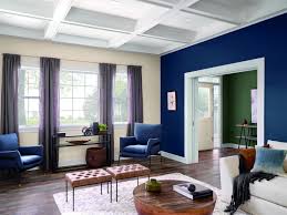
- Darker, moodier jewel tones.
- English European influences.
- Floral wallpapers or prints.
- Lighter wood-tone floors will continue to stay popular and you will notice more of a trend with colourful cabinets — not just on the islands but all over.
- Stained wood — in particular, oak — are being used more in cabinets. ‘
- All metallics are in, and mixing them is totally on-trend.
- Porcelain countertops.
- Smart home technology. This is a trend that keeps building momentum from thermostats, to lights to slow cookers and talking fridges. The smarter the home, the better
- Shiplap in moderation.
Basically, this year, it appears that less is more. When building, designing or remodelling a home – you should think about quality or quantity and the longevity of use.
Something like is trending this year.
Now That You Know What’s In, What’s Out for 2020 Design Trends?
- Paint it white (It’s the go-to for house flips. And basically everyone’s home has taken on a sterile feel). Don’t get us wrong, it looks clean and polished and a good white home is always great to look at, however, if you plan on sprucing up your home… this might not be the way to go?
- Boho unorganized haphazard design. Including the random application of bad wood siding, stone accents — both real and sticky stone — burned wood, token board-formed concrete walls, random window types and sizes, bright colours, and token flat roofs. Some of this in moderation is fine, going overboard and making your house hard to navigate in terms of “design” is not so cool.
- Building cheaply. This is never a good idea, but some people looking to flip quickly follow this path. Usually with no regard for craft and calling it modern.
- Corrugated siding.
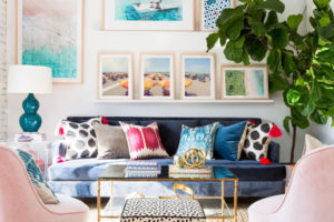
- Color colour everywhere. We have visited some homes where the kitchen is beige. Bathrooms are green. Bedrooms are grey and bonus rooms have a painted wall feature of a very dark or very vibrant colour. It’s hard for people to see themselves through all of that.
- Last but not least monotones. You need some colour, we don’t want to contradict ourselves, some colour. But don’t attempt to use the whole colour palette in your home.
These designs are out. As you can see, these are both “busy” and hard for some people to look past.
It appears that a lot of colour is out and so is a monotone home that feels sterile and lifeless. The good news is that even if your home is all white, it is easy to add accent colours to rooms with paintings, comforters , pillows and side table accents. Those are also easy and cheap to do.
As always, if you need help buying or selling your home, or with an appraisal of staging, do not hesitate to contact Gregg or Ryan Bamford.


